Color Field
The color field is a visual color picker. This field is used for content values that handle the rendering of color. Can be saved as RGB or hex value.
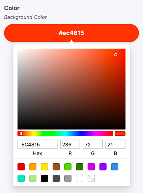
There are two types of color widgets, "sketch" or "block". The "sketch" widget allows the editor to pick a color from the familiar picker seen below.

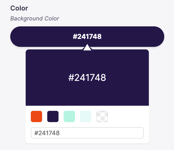
The "block" widget allows the editor to choose from a set of predefined color swatches.

Definition
Below is an example of how a color field could be defined in a Gatsby remark form. Read more on passing in form field options here.
const BlogPostForm = {
  fields: [
    {
      name: 'rawFrontmatter.background_color',
      component: 'color',
      label: 'Background Color',
      description: 'Edit the page background color here',
      colorFormat: 'hex',
      colors: ['#EC4815', '#241748', '#B4F4E0', '#E6FAF8'],
      widget: 'sketch',
    },
    // ...
  ],
}
Options
name: The path to some value in the data being edited.component: The name of the React component that should be used to edit this field. Available field component types are defined herelabel: A human readable label for the field. This label displays in the sidebar and is optional. If no label is provided, the sidebar will default to the name.description: An optional description that expands on the purpose of the field or prompts a specific action.colorFormat: Optionally specify whether you want the color value to be a hexadecimal ('hex') or RBG value.colors: An array of 'swatch' values that will either display as options below the "sketch" widget, or will serve as swatch options for the "block" widget. If no colors are passed, a set of default colors will render, ROYGBIV style.widget: An optional string indicating whether the "sketch" or "block" widget should render. This will default to "sketch" if no value is passed.
Interface
interface ColorConfig {
  component: 'color'
  name: string
  label?: string
  description?: string
  colorFormat?: 'hex' | 'rgb' // Defaults to "hex"
  colors?: string[]
  widget?: 'sketch' | 'block' // Defaults to "sketch"
}