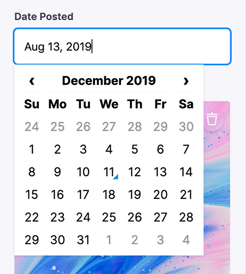
Date & Time Field
The date field represents a date and time picker. It can be used for data values that are valid date strings.

Definition
Below is an example of how a date field could be defined in a Gatsby remark form. Read more on passing in form field options here.
const BlogPostForm = {
  fields: [
    {
      label: 'Date',
      name: 'rawFrontmatter.date',
      component: 'date',
      dateFormat: 'MMMM DD YYYY',
      timeFormat: false,
    },
    // ...
  ],
}
Options
This field plugin uses react-datettime under the hood.
interface DateConfig extends DatetimepickerProps {
  name: string
  component: 'date'
  label?: string
  description?: string
  dateFormat?: boolean | string // Extra properties from react-datetime
  timeFormat?: boolean | string // Moment date format
}
Tina Options
name: The path to some value in the data being edited.component: The name of the React component that should be used to edit this field. Available field component types are defined herelabel: A human readable label for the field. This label displays in the sidebar and is optional. If no label is provided, the sidebar will default to the name.description: An optional description that expands on the purpose of the field or prompts a specific action.
Additional Options
Any extra properties added to the the date field definition will be passed along to the react-datettime component. Moment.js format is used. See the full list of options here.