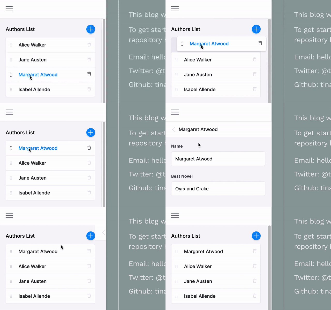
Group-List Field
The Group List field represents a list of group fields. This field exports an array of objects.
Use this field when you want to support multiple entities that all have the same shape. Each entity will appear in a list where you can add and delete them. You can then click into an entity to edit its individual fields according to the Group List's field definition.

Definition
Below is an example of how a group-list field could be defined in a JSON form. Read more on passing in JSON form field config options here.
For example, if we had a list of authors in a JSON file:
{
  "authors": [
    {
      "name": "Alice Walker",
      "id": "alice-walker",
      "best-novel": "The Color Purple"
    },
    {
      "name": "Margaret Atwood",
      "id": "margaret-atwood",
      "best-novel": "Oyrx and Crake"
    },
    {
      "name": "Isabel Allende",
      "id": "isabel-allende",
      "best-novel": "Daughter of Fortune"
    }
  ]
}
Our group-list field config would look like this:
const formOptions = {
  fields: [
    {
      label: 'Authors List',
      name: 'rawJson.authors',
      component: 'group-list',
      description: 'Authors List',
      itemProps: item => ({
        key: item.id,
        label: item.name,
      }),
      defaultItem: () => ({
        name: 'New Author',
        id: Math.random()
          .toString(36)
          .substr(2, 9),
      }),
      fields: [
        {
          label: 'Name',
          name: 'name',
          component: 'text',
        },
        {
          label: 'Best Novel',
          name: 'best-novel',
          component: 'text',
        },
      ],
    },
    //...
  ],
}
Field Options
name: The path to some value in the data being edited.component: The name of the React component that should be used to edit this field. Available field component types are defined herelabel: A human readable label for the field. This label displays in the sidebar and is optional. If no label is provided, the sidebar will default to the name.description: An optional description of the field.fields: An array of fields that will render as a sub-menu for each group item. The fields should map to editable content.defaultItem: An optional function to provide thegroup-listitem with default data upon being created.itemProps: An optional function that generatespropsfor each group item. It takes the item as an argument.key: This property is used to optimize the rendering of lists. If rendering is causing problems, usedefaultItemto generate a new key, as is seen in this example. Feel free to reference the React documentation for more on keys and lists.label: A readable label for the newgroup-listitem.
Interface
import { Field } from '@tinacms/core'

interface GroupListConfig {
  component: 'group-list'
  name: string
  label?: string
  fields: Field[]
  defaultItem?: object | (() => object)
  itemProps?(
    item: object
  ): {
    key?: string
    label?: string
  }
}