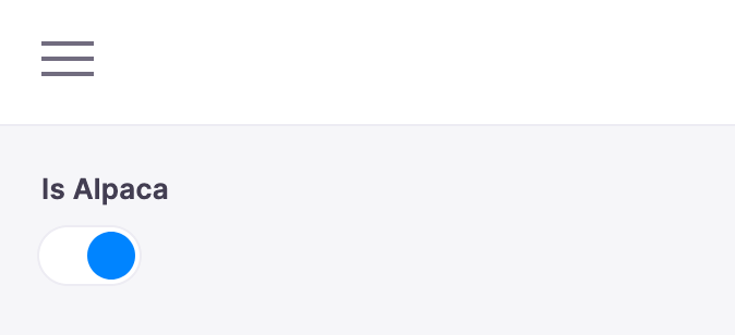
Toggle Field
The toggle field represents a true/false toggle. This field is typically used for boolean content values. You could use this to toggle a certain feature on the page on or off.

Definition
Below is an example of how a toggle field could be defined in a Gatsby remark form. Read more on passing in form field options.
const BlogPostForm = {
  fields: [
    {
      name: 'rawFrontmatter.is_hidden',
      component: 'toggle',
      label: 'Hide Details',
      description: 'Choose whether to hide or show details here',
    },
    // ...
  ],
}
Options
name: The path to some value in the data being edited.component: The name of the React component that should be used to edit this field. Available field component types are defined herelabel: A human readable label for the field. This label displays in the sidebar and is optional. If no label is provided, the sidebar will default to the name.description: An optional description that expands on the purpose of the field or prompts a specific action.
Interface
interface ToggleConfig {
  component: 'Toggle'
  name: string
  label?: string
  description?: string
}